

Introducing Custom Dashboards: Visualize & Analyze Your Data
2 minutes read

Introducing Custom Dashboards: Visualize & Analyze Your Data

Written by Burak Kantarcı
Product Manager @Thundra


We are excited to announce the launch of Thundra APM’s fully customizable custom dashboards to meet our customers’ needs for visualizing, analyzing, and troubleshooting their observability data.
This new functionality brings the freedom of building custom dashboards that allows analyzing performance metrics on your application data such as customer experience, business-level metrics, and any key performance indicators you care about.
By using Thundra APM’s custom dashboards, you will be able to reach the issue root-causes by visualizing context-rich monitoring, debugging and troubleshooting information with correlated traces, metrics, and logs by Thundra’s automated approach.
Create Your Dashboards – Stay On Top Of Your KPIs
In your Thundra APM account, dashboards organize your widgets to give a general overview and analyze your application data based on the constraints you decide.
See how it works in less than 2 minutes
You can add/organize/remove widgets to your custom dashboards to visualize the function counts, error types, error counts, average durations, and etc. Please refer to our documentation about how to create custom dashboards and add widgets to your dashboards.
By Thundra APM’s custom dashboards, you can easily analyze the most erroneous or high latency requests. For example you can watch the number or requests in an application and catch spikes in seconds. You can look from the latency perspective and identify performance issues or degradations in calls.
Query Your Data With Widgets
You can run queries on your data to create custom charts and visualize them with the help of widgets to add to your dashboards to create a birds-eye view of your most important metrics.
Unlimited number of use cases are possible to query your data by creating widgets in your dashboards, so nothing escapes your attention.
Let’s say that you want to group by Node.JS functions with the highest average latency. Just write the below query and save your widget in your desired custom dashboard.
Runtime=node ORDER BY AVG(Duration) DESCVisualizing your custom analysis can help your answers questions such as:
- Which functions are the most costly ones in a time period?
MonthlyEstimatedCost > 10 ORDER BY EstimatedCost DESC- Which functions are the most invoked ones with timeouts?
COUNT(Timeout) > 0 ORDER BY COUNT(Invocation) DESC- Which functions have high P90 memory usage?
PERC90(UsedMemory) >= 512- Which functions are unhealthy (mostly erroneous) in a specific region?
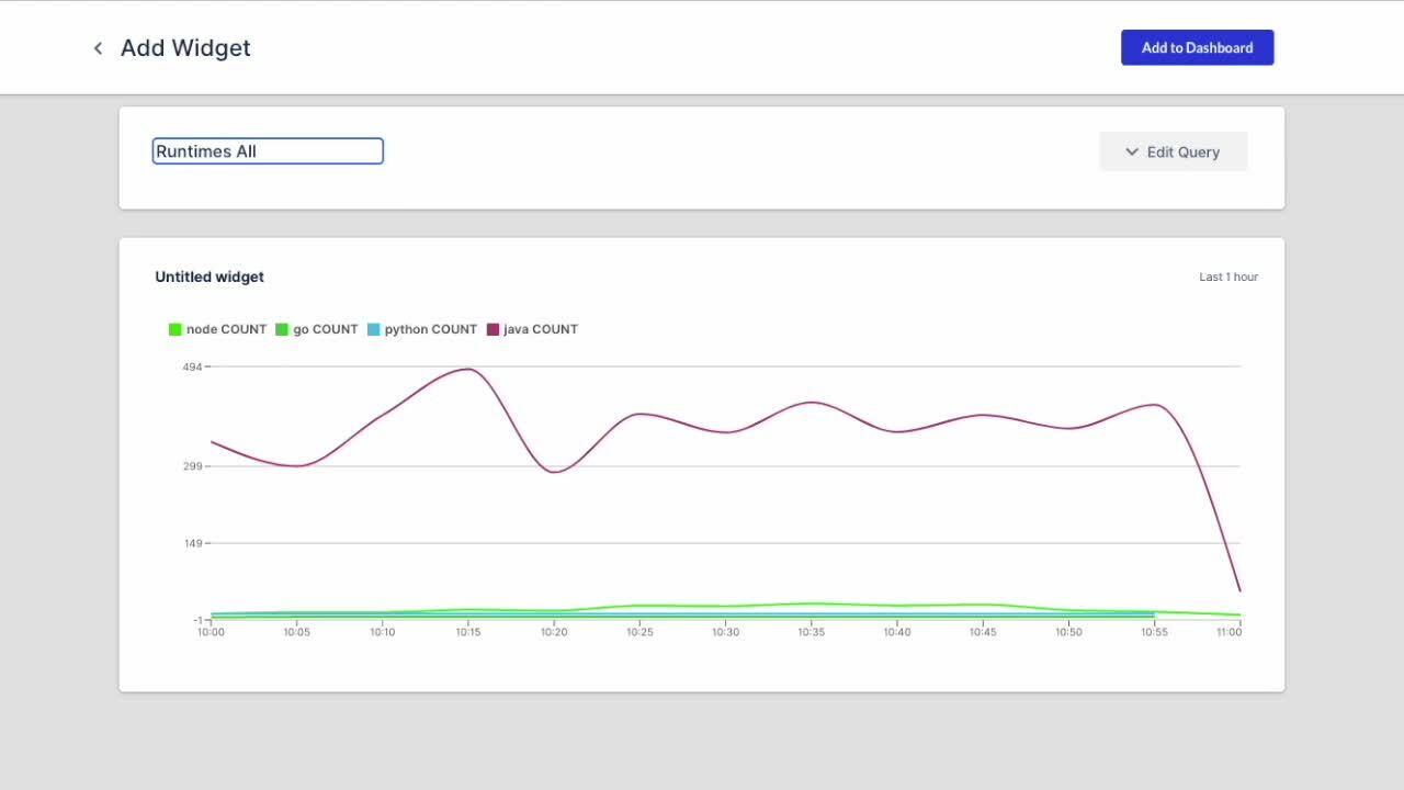
Region=us-east-1 ORDER BY Health DESCAll you have to do is click on the “Add widget” button on the top right corner of your dashboard. Write your query and click on the “Run Query” button. Then you can add the widget to your dashboard by clicking the “Add to Dashboard” button. You can find detailed information about how to create and add widgets to your custom dashboards in our documentation.

A sample custom dashboard composed of widgets
Thundra APM’s custom dashboards enable you to focus on specific areas in your applications. For example, after making changes to your application, you can monitor system performance before and after the changes to see any latency or duration issues in these specific timeframes.
Digging deeper into the root-cause of a potential problem is pretty simple. You can start troubleshooting by correlating your key performance indicators and visualize them as widgets in your dashboards.
Get Started Using Thundra APM’s Custom Dashboards
As an automated application observability platform, Thundra APM brings your business-level metrics and your key performance indicators at your fingertips. You can customize the way you want to monitor, debug, and troubleshoot distributed microservice environments and understand and manage performance.
If you haven’t started your Thundra journey, you can get started by taking your free Thundra account. Custom dashboards feature is at your service once you get started with Thundra APM. We will be glad to answer your questions or get your feedback through our community slack, Twitter, [email protected], or our contact us page.
SHARE


×
SUBSCRIBE TO OUR BLOG
Get our new blogs delivered straight to your inbox.
THANKS FOR SIGNING UP!
We’ll make sure to share the best materials crafted for you!
2 minutes read
Introducing Custom Dashboards: Visualize & Analyze Your Data
Written by Burak Kantarcı
Product Manager @Thundra
We are excited to announce the launch of Thundra APM’s fully customizable custom dashboards to meet our customers’ needs for visualizing, analyzing, and troubleshooting their observability data.
This new functionality brings the freedom of building custom dashboards that allows analyzing performance metrics on your application data such as customer experience, business-level metrics, and any key performance indicators you care about.
By using Thundra APM’s custom dashboards, you will be able to reach the issue root-causes by visualizing context-rich monitoring, debugging and troubleshooting information with correlated traces, metrics, and logs by Thundra’s automated approach.
Create Your Dashboards – Stay On Top Of Your KPIs
In your Thundra APM account, dashboards organize your widgets to give a general overview and analyze your application data based on the constraints you decide.
See how it works in less than 2 minutes
You can add/organize/remove widgets to your custom dashboards to visualize the function counts, error types, error counts, average durations, and etc. Please refer to our documentation about how to create custom dashboards and add widgets to your dashboards.
By Thundra APM’s custom dashboards, you can easily analyze the most erroneous or high latency requests. For example you can watch the number or requests in an application and catch spikes in seconds. You can look from the latency perspective and identify performance issues or degradations in calls.
Query Your Data With Widgets
You can run queries on your data to create custom charts and visualize them with the help of widgets to add to your dashboards to create a birds-eye view of your most important metrics.
Unlimited number of use cases are possible to query your data by creating widgets in your dashboards, so nothing escapes your attention.
Let’s say that you want to group by Node.JS functions with the highest average latency. Just write the below query and save your widget in your desired custom dashboard.
Runtime=node ORDER BY AVG(Duration) DESCVisualizing your custom analysis can help your answers questions such as:
- Which functions are the most costly ones in a time period?
MonthlyEstimatedCost > 10 ORDER BY EstimatedCost DESC- Which functions are the most invoked ones with timeouts?
COUNT(Timeout) > 0 ORDER BY COUNT(Invocation) DESC- Which functions have high P90 memory usage?
PERC90(UsedMemory) >= 512- Which functions are unhealthy (mostly erroneous) in a specific region?
Region=us-east-1 ORDER BY Health DESCAll you have to do is click on the “Add widget” button on the top right corner of your dashboard. Write your query and click on the “Run Query” button. Then you can add the widget to your dashboard by clicking the “Add to Dashboard” button. You can find detailed information about how to create and add widgets to your custom dashboards in our documentation.
A sample custom dashboard composed of widgets
Thundra APM’s custom dashboards enable you to focus on specific areas in your applications. For example, after making changes to your application, you can monitor system performance before and after the changes to see any latency or duration issues in these specific timeframes.
Digging deeper into the root-cause of a potential problem is pretty simple. You can start troubleshooting by correlating your key performance indicators and visualize them as widgets in your dashboards.
Get Started Using Thundra APM’s Custom Dashboards
As an automated application observability platform, Thundra APM brings your business-level metrics and your key performance indicators at your fingertips. You can customize the way you want to monitor, debug, and troubleshoot distributed microservice environments and understand and manage performance.
If you haven’t started your Thundra journey, you can get started by taking your free Thundra account. Custom dashboards feature is at your service once you get started with Thundra APM. We will be glad to answer your questions or get your feedback through our community slack, Twitter, [email protected], or our contact us page.
SHARE
We are excited to announce the launch of Thundra APM’s fully customizable custom dashboards to meet our customers’ needs for visualizing, analyzing, and troubleshooting their observability data.
This new functionality brings the freedom of building custom dashboards that allows analyzing performance metrics on your application data such as customer experience, business-level metrics, and any key performance indicators you care about.
By using Thundra APM’s custom dashboards, you will be able to reach the issue root-causes by visualizing context-rich monitoring, debugging and troubleshooting information with correlated traces, metrics, and logs by Thundra’s automated approach.
Create Your Dashboards – Stay On Top Of Your KPIs
In your Thundra APM account, dashboards organize your widgets to give a general overview and analyze your application data based on the constraints you decide.
See how it works in less than 2 minutes
You can add/organize/remove widgets to your custom dashboards to visualize the function counts, error types, error counts, average durations, and etc. Please refer to our documentation about how to create custom dashboards and add widgets to your dashboards.
By Thundra APM’s custom dashboards, you can easily analyze the most erroneous or high latency requests. For example you can watch the number or requests in an application and catch spikes in seconds. You can look from the latency perspective and identify performance issues or degradations in calls.
Query Your Data With Widgets
You can run queries on your data to create custom charts and visualize them with the help of widgets to add to your dashboards to create a birds-eye view of your most important metrics.
Unlimited number of use cases are possible to query your data by creating widgets in your dashboards, so nothing escapes your attention.
Let’s say that you want to group by Node.JS functions with the highest average latency. Just write the below query and save your widget in your desired custom dashboard.
Runtime=node ORDER BY AVG(Duration) DESCVisualizing your custom analysis can help your answers questions such as:
- Which functions are the most costly ones in a time period?
MonthlyEstimatedCost > 10 ORDER BY EstimatedCost DESC- Which functions are the most invoked ones with timeouts?
COUNT(Timeout) > 0 ORDER BY COUNT(Invocation) DESC- Which functions have high P90 memory usage?
PERC90(UsedMemory) >= 512- Which functions are unhealthy (mostly erroneous) in a specific region?
Region=us-east-1 ORDER BY Health DESCAll you have to do is click on the “Add widget” button on the top right corner of your dashboard. Write your query and click on the “Run Query” button. Then you can add the widget to your dashboard by clicking the “Add to Dashboard” button. You can find detailed information about how to create and add widgets to your custom dashboards in our documentation.
A sample custom dashboard composed of widgets
Thundra APM’s custom dashboards enable you to focus on specific areas in your applications. For example, after making changes to your application, you can monitor system performance before and after the changes to see any latency or duration issues in these specific timeframes.
Digging deeper into the root-cause of a potential problem is pretty simple. You can start troubleshooting by correlating your key performance indicators and visualize them as widgets in your dashboards.
Get Started Using Thundra APM’s Custom Dashboards
As an automated application observability platform, Thundra APM brings your business-level metrics and your key performance indicators at your fingertips. You can customize the way you want to monitor, debug, and troubleshoot distributed microservice environments and understand and manage performance.
If you haven’t started your Thundra journey, you can get started by taking your free Thundra account. Custom dashboards feature is at your service once you get started with Thundra APM. We will be glad to answer your questions or get your feedback through our community slack, Twitter, [email protected], or our contact us page.
*** This is a Security Bloggers Network syndicated blog from Thundra blog authored by Burak Kantarcı. Read the original post at: https://blog.thundra.io/introducing-custom-dashboards-visualize-and-analyze-your-data
