

Finding Signals in a Flood of Data

You’re at a packed cocktail party sponsored by the biggest player in your industry. Potential customers are present and you’re ready to give your pitch if only you could find them. There is plenty of information in the room; too much, in fact. You recognize industry buzzwords here and there but there is too much noise to overhear anything meaningful. People are wearing name tags, carrying swag with company logos, sitting in groups, and standing alone with their iPhones. It feels like too much to process all of these shallow clues. What trick could help tackle this challenge?
This post presents analogies between solving a problem with human intuition versus an algorithm. The point is to draw parallels between intuition and data analysis techniques both to demystify some useful technology and to augment our intuition with the ability to think like a Data Scientist. Whether reading the room for opportunities or scanning log files from website activity for threats, manual and formulaic techniques for finding signals in a flood of data have a lot in common.
Back at the cocktail party, it would make the job a whole lot easier if bright yellow hats identified your best prospects. An experienced salesperson might be able to intuitively process many of the clues in the room and imagine yellow hats floating above the crowd. This is called reading the room. Someone skilled at reading a room not only knows what clues to look for but also has a theory about what those clues mean.
The background music has now shifted from pumping EDM to the calming tones of a classical string quartet and it is now easier to hold a conversation. The bartenders are closing their stations as a curtain opens to a banquet hall. The crowd thins as those who mainly showed up for the drinks head out, leaving a smaller group of those more likely to have come for the business connections. Suddenly it feels much easier to read the room. The noise has been filtered out and it is easier to apply theories to the clues. Who are the influencers in the room? Who are at the tables that are getting filled first? Who is more interested in another round of drinks than in networking within your industry? These are the kinds of details that an expert in reading the room might consider.
Each type of clue can be thought of as a separate dimension of information. When the clues are successfully processed, they can be distilled into a single yellow hat dimension. Data Scientists build systems that simulate the skills of an expert and apply them programmatically at a massive scale. Learning and encoding the relationship between clues is an interesting topic in itself but we’ll keep this post simple by just looking at clues that have already been fit to theories and encoded for processing.
Sampling The Room
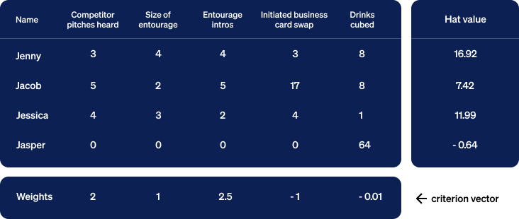
A guest named Jenny was accompanied by an entourage of four who seemed to take cues from her and selectively introduce her to other guests. Three of your competitors approached her group, she listened to their pitches and exchanged business cards with them. In addition to Jenny, you collected this kind of information for several of the guests.
Treating each clue as a dimension, think of the input arriving in two dimensions. These two will suffice as an initial example but we’ll soon look at ways to consider many more dimensions of input. The output we want is one dimension regardless of the number of input dimensions. It will rank how deserving each guest is of a yellow hat. The guest with the highest rank will be treated as your top priority sales prospect.
Relative Importance Between Clues
When computing our output, some clues deserve more weight than others. Hearing a pitch from one of your competitors is clearly a useful clue. The size of the guest’s entourage indicates that they are likely to be an influential decision maker within their organization. Let’s assume that both of these clues are indicators of a good sales prospect for you but that listening to pitches from your competitors carries twice as much weight. Let’s apply this theory to our samples with some simple math:
Guest’s hat value =
competitors’ pitches heard multiplied by a weight of 2.00 + size of entourage multiplied by a weight of 1.00
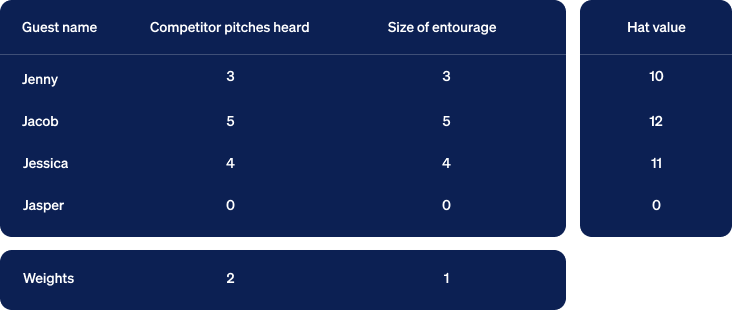
Jenny’s hat value = (3 * 2) + (4 * 1) = 10
Jacob’s hat value = (5 * 2) + (2 * 1) = 12
Jessica’s hat value = (4 * 2) + (3 * 1) = 11
Jasper’s hat value = (0 * 2) + (0 * 1) = 0
This simple formula applies our theory and ranks Jacob as the strongest prospect.
Visualizing Yellow Hats In Two Dimensions
As a means of visualizing this computation, we can turn the numbers into geometry. We begin by collecting the numbers so far into a table with the output in a column to the right. We insert a row below the table containing weights below their corresponding columns.
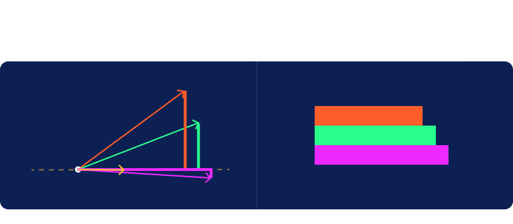
Next, we’ll construct rectangles for each row of input. In the graph below, the first clue is measured in the horizontal dimension and the second vertically. We align all the rectangles at their bottom left corner, known as the origin. We then draw a line extending from that corner to the far corner in the upper right. Jasper’s rectangle is just a dot at the origin so we’ll ignore him for now. Note that we’ve also included a yellow rectangle corresponding to the row of weights at the bottom of the table.
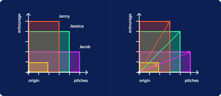
Another name for a line with a length and direction is a vector. Each vector created from the clues for a specific guest will be called a guest vector. Now let’s look at the yellow vector created from the weights given at the bottom of the table. We will call this one a criterion vector since the weights specify criteria placed upon the inputs to compute a ranking of samples as output.
We now hide the boxes and draw a dotted line through the origin oriented in the direction of the criterion vector. This line extends infinitely in both directions. We’ll call it the criterion line. The half of the line from the origin extending in the direction pointed by the vector will be considered the positive direction. The other half will be considered the negative direction.
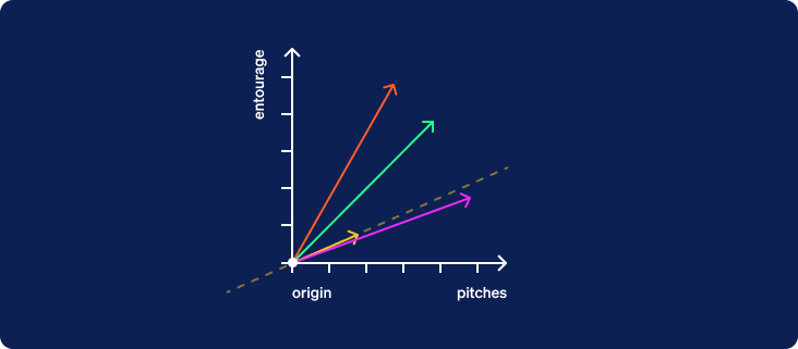
Now that the criterion line has been drawn, we are going to hide the original two axes and rotate the entire graph about the origin so that the criterion line is horizontal with its positive direction to the right.
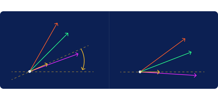
Now imagine a distant light source located vertically above or below the line projecting a shadow from each of the guest vectors onto the criterion line. The positive half of the criterion line is to the right of the origin. In more complex cases, we would sometimes have vectors that cast their shadows in the negative direction to the left of the origin. It is interesting to note the difference between the red and green shadows given that they were cast by vectors of the exact same length.
The length of the shadow plotted on the criterion line will rank the samples in the same order given by the hat values computed earlier. We now have the ability to both compute hat values and visualize them.
To Be Precise
Those familiar with the relationship between a cosine and a dot product will appreciate why we glossed over the length of the criterion vector until now. For the geometric visualization, the length of the criterion vector is irrelevant and its direction alone dictates the criterion line. Since this length is irrelevant, applications that use the technique we’ve described often choose to normalize the criterion vector to a length of one if it doesn’t happen to already equal one. Without normalization, the hat values will equal the product of the length of the shadows and the length of the criterion vector. When normalized, shadow lengths and hat values come out exactly the same. It is not an essential step since it does not affect the order in which hat values are ranked but there is some elegance introduced by this convention.
More Than Two Dimensions Reduced To One
Instead of rectangles, imagine performing a similar computation with 3-dimensional boxes where the vectors extend from their common corner at the origin to the furthest corner of each box. Both the mathematical formula and the visualization extend naturally from 2 to 3 dimensions. Shadows are still perpendicularly projected onto the single dimension of the criterion line.
Beyond three, there is no hard limit to the number of clues or dimensions that can be considered. The process is easiest to visualize in 2 or 3 dimensions but it can mathematically and conceptually be applied to more.
To demonstrate an arbitrary number of dimensions, let’s enrich our hat values with a few more clues.
- As a third clue, let’s count the number of business introductions a guest received from members of their entourage. We’ll assume that this indicates a level of vetting that increases the likelihood of serious conversations and we’ll treat it with slightly more weight than the overall number of competitor pitches heard.
- Exchanging business cards is both a traditional courtesy and a practical way of sharing contact information. There is a subtle clue in knowing who tends to initiate these exchanges and whether they are in a hurry to move on and exchange more cards versus showing more patient deliberation and selectiveness when meeting other guests. We’ll assign a moderately negative value to this clue to treat it as counter-indicative of our ideal prospect.
- As a fifth clue, we’ll count how many beverages each guest drank over the course of the evening. Let’s assume that this is a relatively unimportant clue except in the case of outliers who had a lot to drink. We can achieve this effect by applying a very small negative 1% weight to the cube of drinks consumed. The value won’t appear significant until it climbs the exponential curve to overcome the very small weight.
We now have five dimensions to contend with. Fortunately, the formula scales elegantly to handle them.
Now let’s collect this data in a new table and recompute the hat values.
Showing the math, we have:
Jenny: (3 * 2) + (4 * 1) + (4 * 2.5) + ( 3 * -1) + ( 8 * -0.01) = 16.92
Jacob: (5 * 2) + (2 * 1) + (5 * 2.5) + (17 * -1) + ( 8 * -0.01) = 7.42
Jessica: (4 * 2) + (3 * 1) + (2 * 2.5) + ( 4 * -1) + ( 1 * -0.01) = 11.99
Jasper: (0 * 2) + (0 * 1) + (0 * 2.5) + ( 0 * -1) + (64 * -0.01) = -0.64
Notice the influence of these new clues. The rankings have changed as new clues and weights have been incorporated into the theory that led to this particular criterion vector.
Poor Jasper gets no hat. He finally gets a non-zero hat value but it goes in the negative direction along the criterion line. None of his clues gave him a positive rating and since 4 cubed is 64, he is the one notable outlier in the drinks dimension. After 4 cocktails he rushed out leaving behind any hat he came with.
The Learning Part
When an automated decision making process is built by encoding the knowledge of a human expert, it is known as an expert system. What we’ve covered so far is a way of encoding that knowledge and using it in a formula. The original learning is up to a human but a machine can then apply the formula as an expert system.
When a machine infers a successful decision making process from data to reduce dependence on expert knowledge, it is called machine learning. A method similar to the one described here is often used in machine learning with the main difference being that it also involves learning the criterion vector from data. An expert may still be involved in labeling original data points manually to get things started. This data is then fed to a machine learning algorithm that establishes what criterion vector will produce output values that best agree with the expert’s labels.
Data Scientists are constantly working to shift more of the responsibility for the learning over to automated processes that pull insights from data. This includes techniques for helping experts identify what data will be valuable to collect.
In Conclusion
Reading a room isn’t magic. An experienced salesperson may seem to do it quickly and effortlessly but there is real work behind this skill. It is work that an expert can share with machines using methods built upon elementary math. We can even visualize it geometrically to get a feel for how it works and peel away some of the mystery surrounding the work of experts and machines that replicate their expertise.
If this casual introduction has piqued your interest, the following Wikipedia articles offer a starting point for further reading:
- Cosine Similarity: https://en.wikipedia.org/wiki/Cosine_similarity
- Vector Projection: https://en.wikipedia.org/wiki/Vector_projection
- Vector Space Model: https://en.wikipedia.org/wiki/Vector_space_model
- Information Retrieval: https://en.wikipedia.org/wiki/Information_retrieval
- Pattern Recognition: https://en.wikipedia.org/wiki/Pattern_recognition
- Machine Learning: https://en.wikipedia.org/wiki/Machine_learning
*** This is a Security Bloggers Network syndicated blog from Blog authored by Joe Sandmeyer. Read the original post at: https://blog.castle.io/finding-signals-in-a-flood-of-data/
