
Adventures in Data Visualization (Part 2)
Massaging data to make it actionable
In this multi part data visualization design series, we’re exploring the concepts upon which we’ve used to build our user experience at ShiftLeft. In our product, we manage lots of application data, so while the examples below are generic, the concepts of how-to visualize complex datasets, in an actionable manner, without overwhelming the user is core to how we think about UX design.
In the first post, we explored the limitations of table views, and an iterative approach to mining and massaging raw multidimensional data (an employee database), for the purpose of solving our use case: Preventing employee “burn out”. In this episode I’d like to show an approach and a few examples of data visualizations to help make our data more actionable.
As a result of our efforts in part 1, we’ve been able to simplify our employee data by deriving a “health score” that can help us predict someone’s susceptibility to burning out:
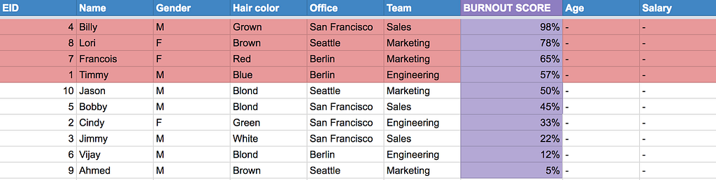
This is a great step towards taking raw data, and making it actionable around a specific user goal. For the sake of simplicity, we’ve hidden the underlying fields that contributed to this normalized health score (days since hired and vacation days taken %).
Beyond table views
Scrolling through short entity lists might work well, however in reality lists can end up being hundreds if not thousands of rows. Additionally, there’s a lost opportunity here: To summarize the data such that the end user can gain a better understanding about the system on whole, rather than just the discrete entities (or rows of people in this case). In essence, this is the very purpose of data visualizations: A way to visually provide meaning to data so that the end user can take action. Often the visual approach is much easier to interpret than data in raw form.


One example is imagine a data set of 1,000s of cities in the world where you confidently have a bivariate relationship between distance to clean water access (in meters) and average human life expectancy (in years from birth). While you can easily sort a long list by a particular variable, the raw data can make it very difficult to quickly understand the following:
- Are there any patterns or natural groupings of cities that might signal another influencing factor?
- Are there any strange outliers I should investigate.
Now consider the following scatter plot visualization of these cities:
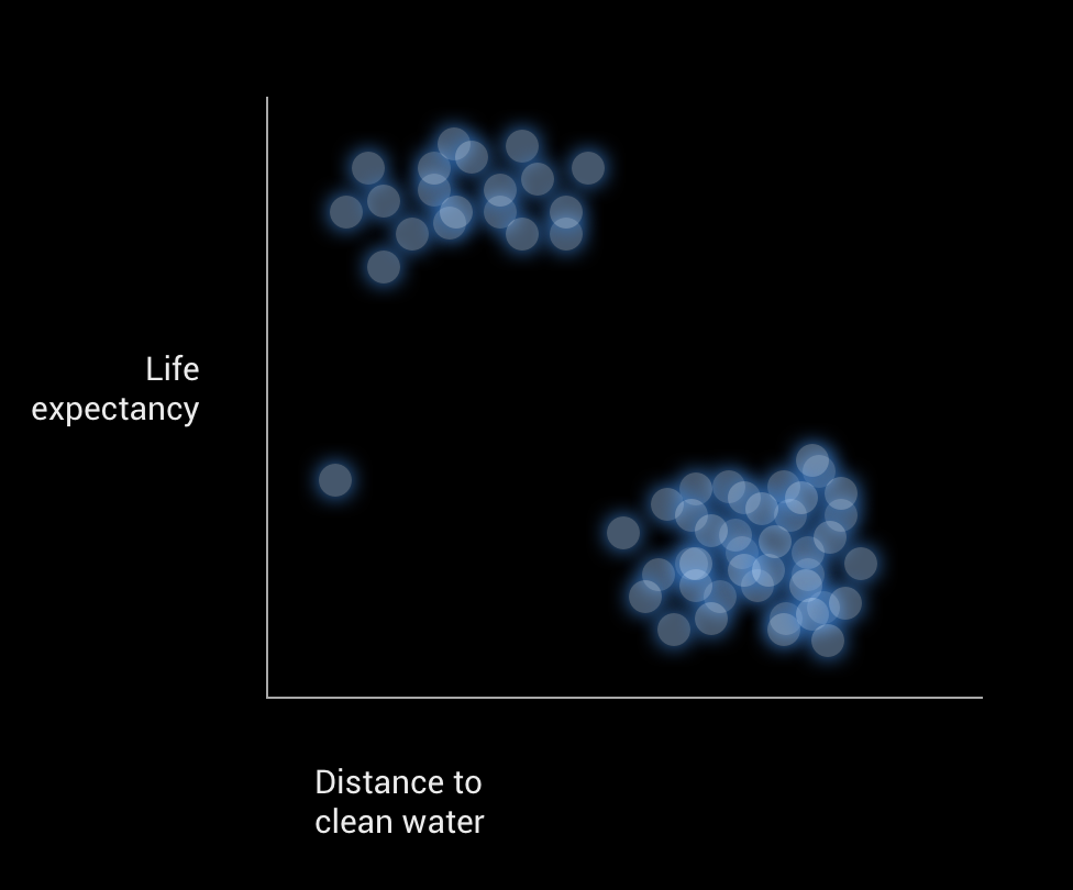
Without much manual labour or help from mathematical tooling, we can instantly see there is an obvious pattern to the data (two clear clusters, indicating another factor is likely), and an outlier (which could be an anomaly or another indicator of an extra variable in play for this particular city). With this simple visual device, we have a powerful data analysis tool in our hands!
Data visualization design process
While I do intend to keep our exercise short for this employee related design problem, I should mention that we’d normally embark on a slightly longer design process, roughly:
- Defining the goals and use cases (or scenarios) that need to be solved for (sometimes from stakeholders, sometimes from more intensive end user UX research)
- Brainstorming or other team oriented design exercises (mostly for idea gathering)
- Sketching many (many) ideas
- Hunting for examples in similar problem spaces
- Evaluating early designs and ideas with stakeholders and real end-users
- Iterating and refining (sometimes returning to step 1, and revisiting your initial use cases)
In more complex data rich scenarios, such as the security related data we collect at ShiftLeft, prototyping with real data is often an essential part of the design process. Once we’ve explored several ideas in sketch (or wireframe) form, we often work closely with a UI engineer to try out a few data driven prototypes. Here’s an example of a schematic I defined to help kick start a prototyping effort with an engineer:
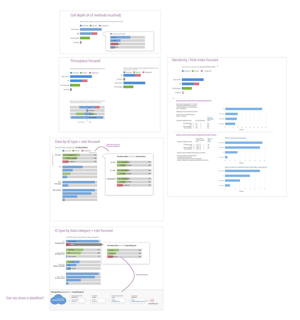
I’ll spare you the long winded explanation of the above visualization ideas, but the takeaways are:
- Force yourself to try several variations, it’s too early or presumptive to get attached to any single idea, therefore we need to prototype a few ideas.
- Annotate, rationalize, and explain how you expect underlying data to drive each chart, as well as what interactions you’d like to support. It can really help an engineer partner understand what you want and how you expect the underlying data to be leveraged.
- Keep in minimal. This isn’t the time to think about the high level nav, iconography, or other details. This is an early phase of design focusing on the epicenter of the problem space: Will your visualization ideas work with real data and solve for the problems you think they should solve for.
- Similarly, keep the engineering effort minimal. Emphasize with the engineers involved that this is “throw away” code, the goal is to vet ideas quickly, not write production quality software.
- Test with humans other than you. If you’re a designer, this should be pretty obvious, but leaving this bullet here just in case 🙂
Back to helping employees
Now that I’ve talked a bit about why you would leverage a data visualization in your user experience, and what the process of designing one might look like. Let’s return to our example “employee database” scenario and empower our end user with visuals that help them make decisions.
As part of our process for envisioning the correct data visualization approach, let’s start by identifying a few high level goals:
- Understand how the org is doing overall in its burnout risk
- Are a lot of employees at risk, or only a few?
- Are there any patterns across that indicate underlying factors?
- Is there a trend, are things getting worse or getting better?
- If there’s a significant change, what is most impacting it?
- Last but not least, find employees that we can take action on.
We can now start to explore a few visualization solutions and evaluate their effectiveness in solving for these cases. For the sake of brevity, we’ll skip most of the design process outlined above and I’ll point out a few charting approaches that come to mind for the above goals.
Histograms
By plotting any metric of interest using a histogram we should be able to make headway into solving for a few of the above goals. The chart below shows what a histogram plot of our employee data by our normalized “burn out” metric might look like:
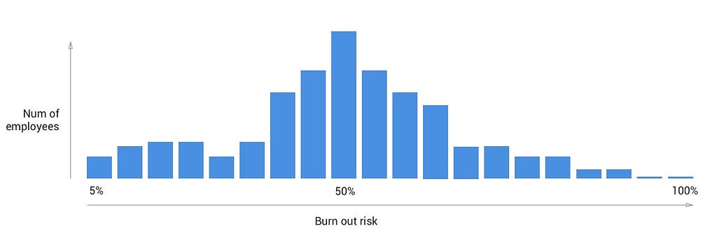
This histogram displays counts of employees (y-axis) by a range of burn out risk (x axis). A quick glance at the chart tells us that we have a substantial grouping of employees in the 50% burnout risk range, with just a few employees that have little risk (left side), and a few employees that have a very high risk (towards the right side). This is called a “normal distribution”. Now, consider the following histogram:
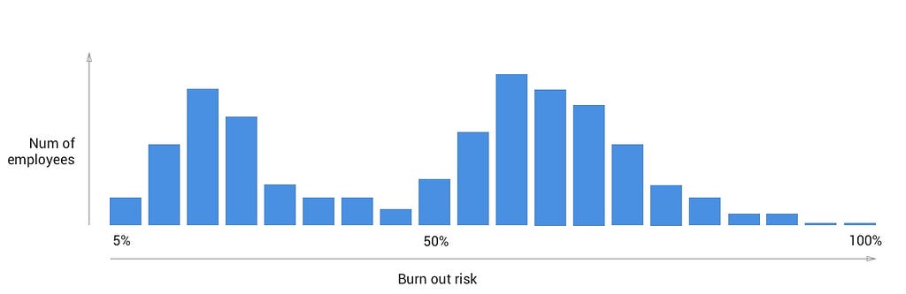
The above example shows a “bimodal distribution”, where we have two obvious groupings of employees. Group A (towards the left) seems to be lower risk, and Group B (towards the right) at a higher risk. For our employee burnout use case, this can be a sign that another factor is in play that needs to be investigated.
Already we have a simple yet powerful visual tool that solves our top two goals: Understand how the org is doing overall, and uncover any patterns that indicate underlying factors.
Given we are designing for an interactive UI realm rather than a static one (such as a published document), let’s provide some interactivity to allow some deeper analysis to take place. One common design pattern I like to use is the master detail pattern, which I’ll summarize as an interaction where a summarizing widget can be clicked on in order to display deeper information about a subset of the overall data set. One way we can achieve this with our histogram is by allowing a drag select action to reveal detail on the subset of employees. Here’s a quick example:
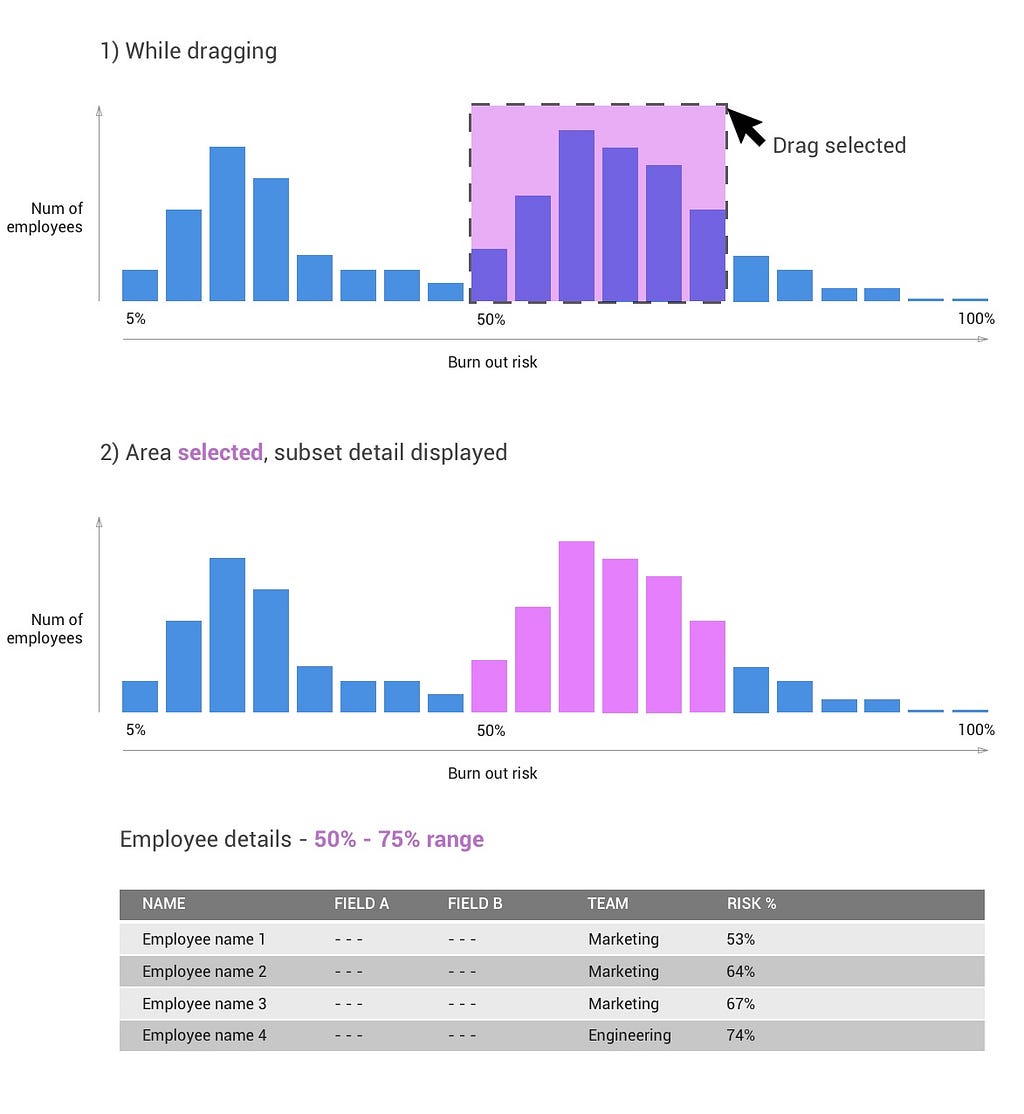
From the above example, we can immediately see that a large portion of the high risk sub selection happens to be from the Marketing Team. Assuming this pattern is unique to this subgroup, our end user can now take further action to understand what might be affecting employees on the marketing team. Simple filter based interactions like this are the difference between a visual data display, and a user experience that facilitates analysis. This is why one of the core interactive principles at ShiftLeft is about supporting a filter based navigation experience.
As an example, here’s the ShiftLeft app summary view. It’s role is to summarize the security health and context of an application in real-time by leveraging several chart displays:
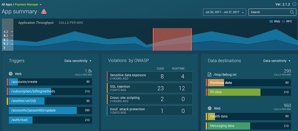
Clicking any chart element on this view filters down on a subset of the data (adding filter cards to the top left of the UI). This maintains as much of the same context as possible, but narrows the end-user’s data set down for deeper analysis:
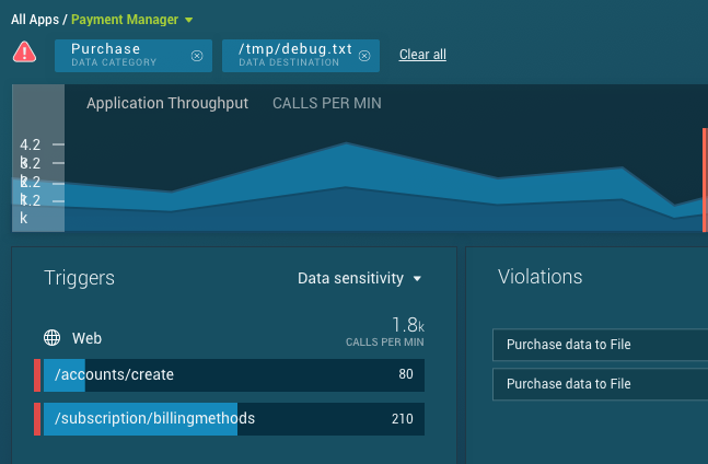
Ideally, the user shouldn’t need to think much while in this workflow. They see something of interest as part of a chart display, they click it (causing a filter), the experience is largely maintained but contorts slightly to reveal deeper information about the item of interest. This user flow would continue until they’ve figured out the source of the issue or have reached some other conclusion.
We’re not done with our employee data user experience yet!
So far, we’ve taken raw data, massaged that data in order to support our key use case with a quantified metric (employee burnout score), and we’ve started to visualize that data using an interactive histogram to support some of our nuanced goals:
- Understand how the org is doing overall
- Understand any patterns that help signal underlying factors (the shape of the histogram, as well as the drill-down capability)
- Find employees to take action on (drill-down capability as well)
In the next installment of this data visualization design series, we’ll look into solving for our last use case “Is there a trend, are things getting worse or getting better”, and finally explore some more advanced interactions and visualization techniques that can further facilitate our end-users analysis of employee burnout.
Stay tuned!
Adventures in Data Visualization (Part 2) was originally published in ShiftLeft Blog on Medium, where people are continuing the conversation by highlighting and responding to this story.
*** This is a Security Bloggers Network syndicated blog from ShiftLeft Blog - Medium authored by Etan Lightstone. Read the original post at: https://blog.shiftleft.io/adventures-in-data-visualization-part-2-4acea567fb88?source=rss----86a4f941c7da---4